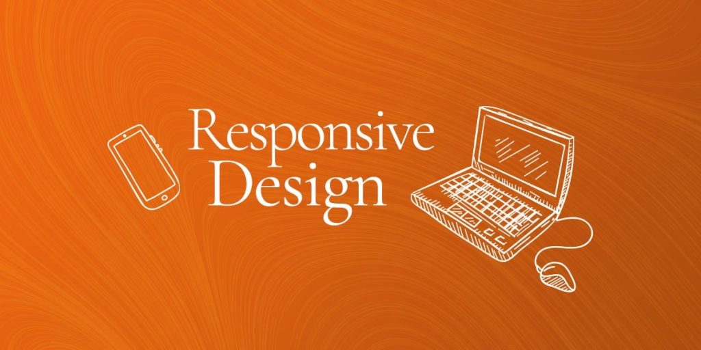
Let’s talk responsive web design.
When we make a website, it is designed with five standard breakpoints that help the page automatically adjust to the width of your browser window – be it a wall-sized projection, a portion of a large desktop monitor, an 11″ laptop, a tablet standing up or on its side, or a smartphone.
We also test each layout on all the standard internet browsers (IE 11, Edge, Firefox, Chrome, Safari, Opera) because each of them displays websites a little differently than the others.
With five breakpoints on six browsers, that means that each design layout is tested 30 times! But even with all that testing, the internet and the tools that we use to access it are always changing. So, it can happen that you pull up a site or open up a page and it doesn’t look quite right. When that happens, we can update it! In order to service your site, we just need a few details.
Key Details Needed to Service Design Responsiveness
Gathering the basic details.
When you notice that something isn’t looking right on a website, giving us some basic details allows us to get to the root of the problem really quickly.
- What page or feature is acting weird?
- What browser(s) is this happening on?
- What size window is this happening at?
What is wrong?
The best way to tell us which page or feature that is acting weird is by providing the link and a screenshot. These two elements can answer 50 other questions we may otherwise have to ask.
Where is this happening?
Telling us what browser(s) you’ve had this happen on, it gives us direction on where the problem may be.
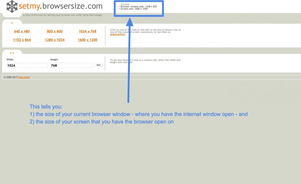
When is this happening?
The size of the window tells us in which breakpoint the error lies. To quickly identify the browser size, open https://browsersize.com/ and look for the tiny details across the top:
Send these details to your web team.
By answering the what/where/when in your initial email request to us, we’ll be able to quickly identify the problem and give you the most efficient service possible.

